The Ask a Curator Day is an initiative that Jim Richardson started back in 2010, and Mar Dixon has continued as its main promoter since 2012. It is a journey that has been held each September on Twitter, and fosters the conversation between curators from museums, galleries and art centers all over the world with Twitter users. All the conversations and debates use the hashtag #AskACurator, which allowed us to analyze all the journey conversations. We have monitored all the tweets that contained the hashtag #askacurator and those that mentioned @AskACurator. First tweet was gathered the 11th of August, 2014, and the last one, one day after the end of the conference, the 18th of September, 2014.
The conference in numbers
We have gathered 47.546 tweets, tweeted by 12.952 different users. This is, an average of 3,67 tweets per user. Tweets are distributed over time as you can see on the following graph: 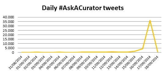 77% of the tweets were published during the Ask A Curator day (Sep 18th), and 9% the day before. We stopped the analysis the day after the event, in order not to alter the result of the study, as a lot of conversations (including the ones from LaMagnética) had a strong bias towards museum professionals, moving from AskACurator’s main objective: the conversations that emerged from museums and museum professionals with the general public.
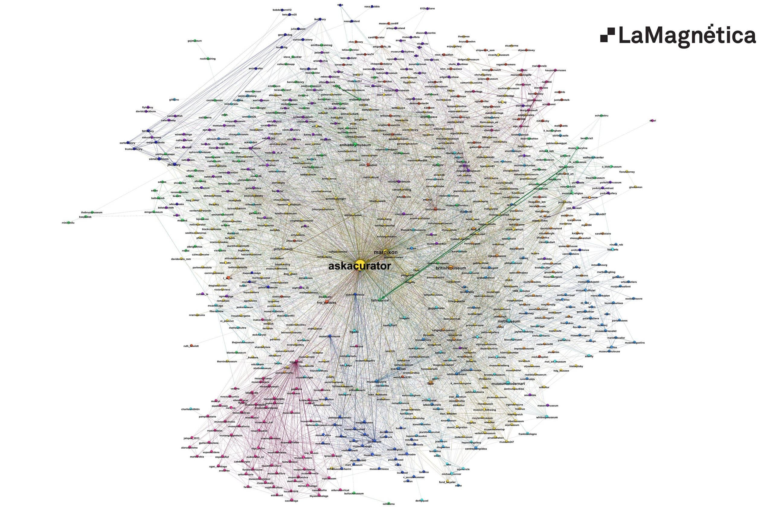
The objective of this study is to analyze the relationships between users during Ask A Curator. It means that we do not focus on previous relationships –who follows who, or previous mentions and retweets- but on those interactions related to Ask A Curator. The established connections are depicted on the following graph: each node is a user and each edge represents a mention or a retweet from one user to another. 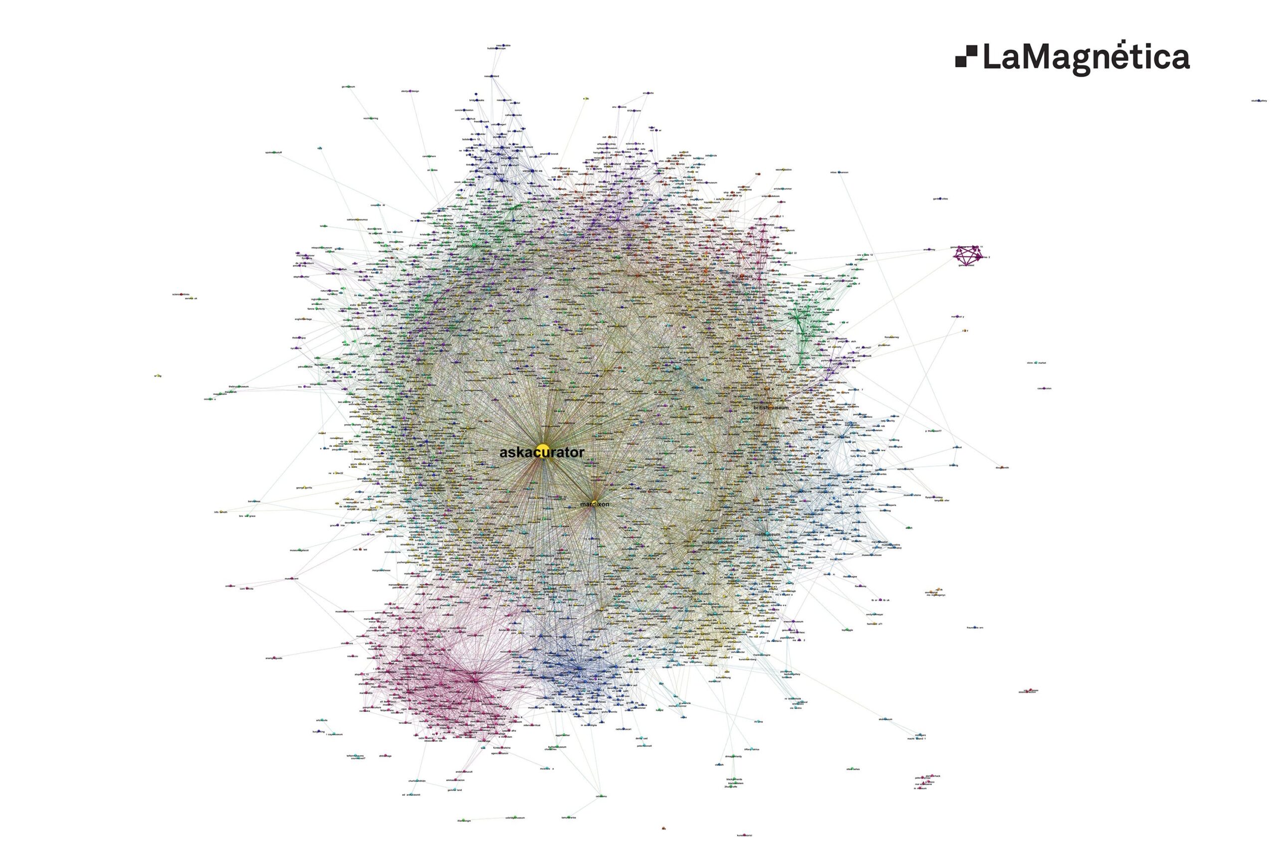 The graph is too dense in order to be readable, so in the following image we present only the core users, the top 6%, selected by their influence. In the calculations involved in the analysis we use all users and tweets, but in the more dense graphs (general graph, US and UK groups) we have to limit the images to the most influential nodes in order to keep the images readable.
To download a high resolution image (9.000×6.000), click here. WE ADVISE YOU TO DOWNLOAD IT AND OPEN IT WITH YOUR IMAGE EDITOR, as your BROWSER’S CACHE MEMORY CAN LIMIT THE RENDERING OF THE IMAGE.
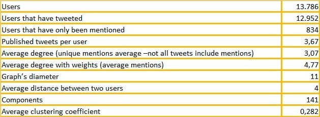
The graph consists of 13.786 users (nodes) that are involved in at least one tweet including #AskACurator or @AskACurator (or both), either being their author or being mentioned. There are 42.356 unique mentions between these users (edges). Neither the nodes nor the edges of the graph have a constant size: the size of a node shows its relevance; while the thickness of the edge indicates the number of mentions and RTs between a pair of users. Here is some data defining the graph, the structure of the Twitter conversation, which we will use in our analysis:
This data let us draw some conclusions:
- There are 141 disconnected groups of users talking about #AskACurator. But, is this a problem? Most of these groups are fairly small: 40 of them consist only on a pair of users each, while 98 are in the range from 3 to 5 users, and there is also a 20-user’s group. Some of these groups consist of real users that have published only one tweet, while some are spammers.
- But over 97% of users and an even higher percentage of tweets are in the main group. This is a relevant result taking into consideration that it has been a one day event with tweets published in many different languages. Despite there are clear country groups for several countries, these are not isolated and remain in the main graph.
- The diameter of the graph –the maximum distance between two users- is a bit high, but nothing unexpected taken into consideration that we have had different languages and two groups of users: a group of museums, museum professional and museum enthusiasts, and a large group of final users that only asked one or two questions during Ask A Curator.
- The average distance between two users is 4. Having a set of almost 14.000 users, this low number reflects that the country groups are dense, and are connected to each other through many paths, involving museums and users who talk to other people in at least two countries.
- The median of the unique mentions sent/received by users is 1,7 points lower than the median of mentions sent/received by users. This shows that repeated mentions are a common behavior.
- If I am related to A and B, which is the probability that A and B are also connected? Likely, higher than the probability of two random nodes being connected. This is what the clustering coefficient tries to show. (Do not take this as a formal definition, but it gets to the point without formulas). For a set of this size and average degree (an average user is connected to 3,07 users of a set of almost 14,000), the clustering coefficient is quite high and reflects different kinds of clustering:
- Country or language related.
- Clusters around some museums
- Tweets mentioning several users that are replied. Let’s see an example: @lamagnetica publishes a tweet mentioning @AskACurator, @MarDixon, @BritishMuseum and @Tate. And imagine (it’s just an example) that these users have not yet been connected in an #AskACurator tweet. Now they are all connected to @lamagnetica, but no to each other. So the clustering coefficient in this small portion of the graph is 0 (0/6). After this, Mar Dixon retweets it through @MarDixon and through @AskACurator. Now, these two profiles are directly related with @BritishMuseum and @Tate, and everybody is connected to everybody except @BritishMuseum and @Tate to each other. So at this point the clustering coefficient is 83% (5/6). And it can easily get to 100% in this sample.
Country groups
The different communities seen on the graph are groups of museums and users of the same country or language. We have highlighted some of them on the graph so they can be easily identified. The largest communities of the graph are the United States and the UK ones, but as long as they occupy a big part of the graph, we haven’t put their name on it. As Mar Dixon explains on her post about the initiative, this year a total amount of 721 museums from 43 different countries have taken part in the Ask A Curator initiative, and are distributed as shown in the following chart: 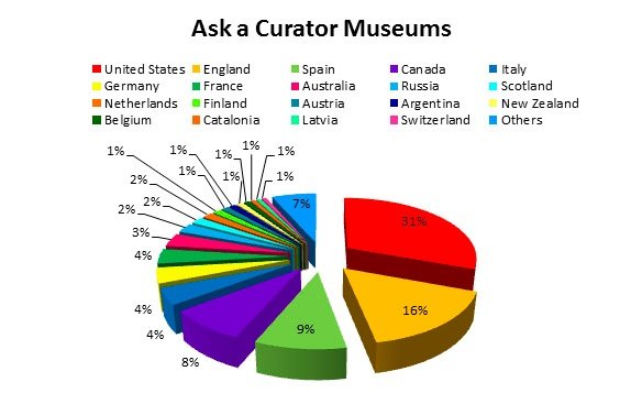 We observe that the United States and the UK represent more or less a 50% of the total museums taking part of the event, bringing 221 (US) and 118 museums (UK). The relevance of these two communities is also notorious when we check out which are the most influential users. In order to seize the relevance of a user within the network, we can use different centrality measures. In this analysis we are using two: PageRank (relevance, influence) and the number of received mentions (a measure easier to understand and calculate, yet less accurate):
 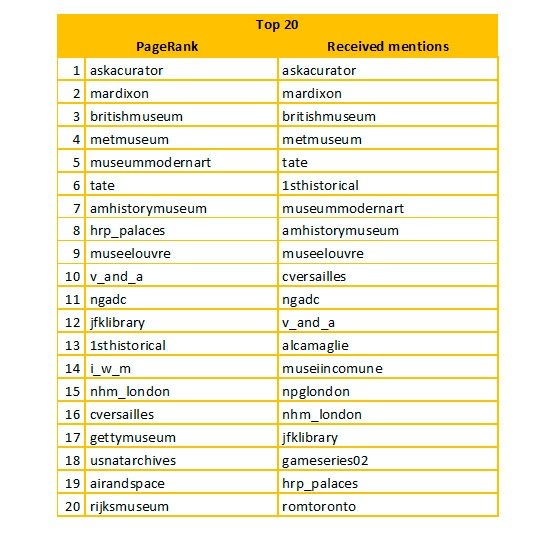 Note that the first 4 users are the same in both rankings while most of the rest, although they switch positions, are repeated in both lists. From the list of 20 users, 15 are found in both of them. If we analyze the nationality of each user that appears among the Top 20 list according to its PageRank, we’ll have them distributed within the following countries:
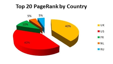
The relevance of US and UK museums is due to several facts:
- The relevance of some of their museums, and their online strategy.
- The fact that @AskACurator and its soul @MarDixon are both British.
- The important number of US (31%), UK (16%) and Canadian (8%) museums compared to other countries with a rich heritage: Spain (9%), France (4%), Italy (4%), etc.
- Having English as the main language results in a competitive advantage. Apart from some cultural factors, which are important, it allows English-speaking museums to easily communicate with museums in other countries, while is not that easy for museums in other countries with different languages to communicate with the rest.
The following image shows the main Twitter users in the American community: 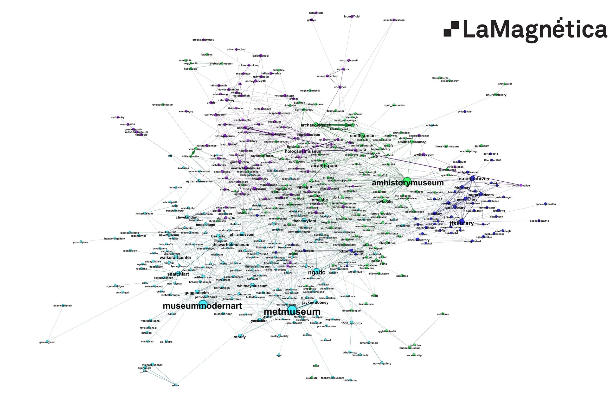
To download a high resolution image (9.000×6.000), click here. Download it and open it with an image editor (see note above).
Likewise, the most influential users in the British community: 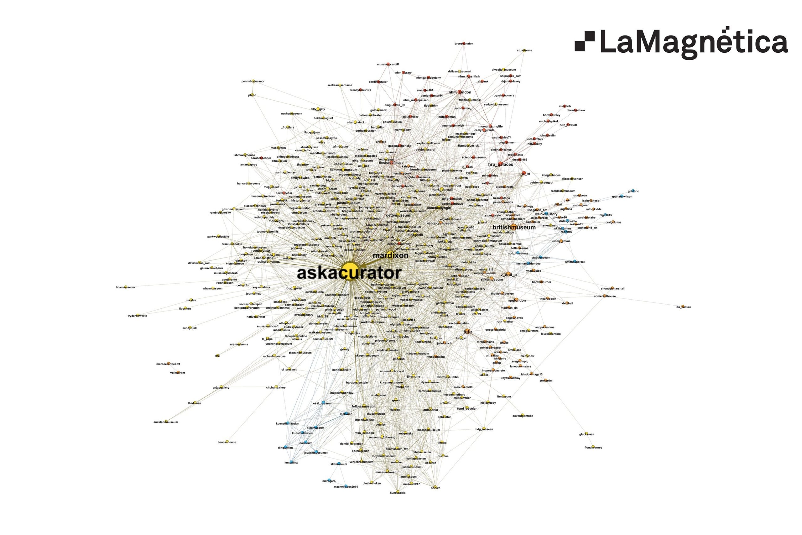
To download a high resolution image (9.000×6.000), click here. Download it and open it with an image editor (see note above).
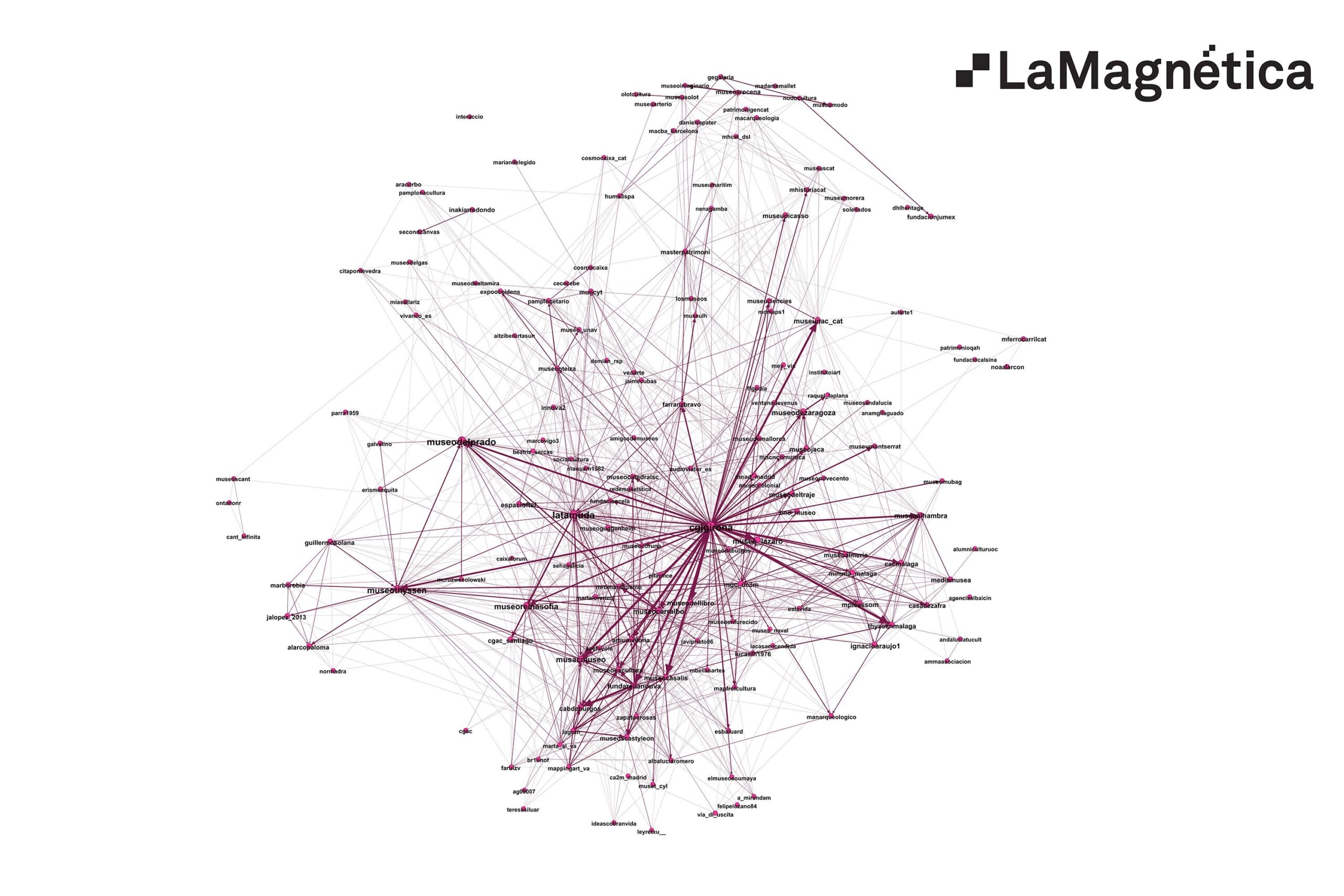
Core users in the Spanish community:
To download a high resolution image (9.000×6.000), click here. Download it and open it with an image editor (see note above).
The Italian community. In this case all Twitter users in the Italian community are plotted, as it is smaller than the previous ones: 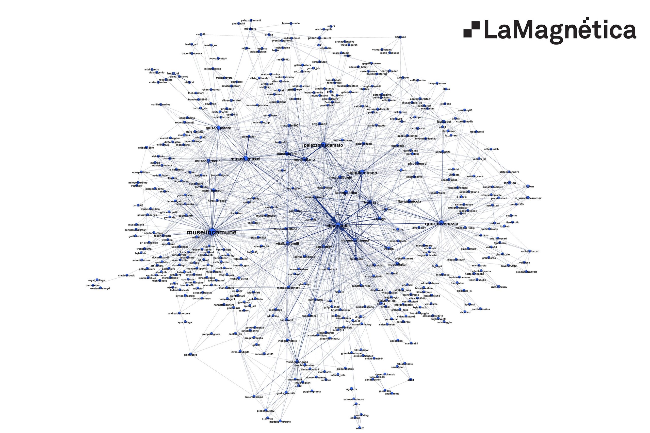
To download a high resolution image (9.000×6.000), click here. Download it and open it with an image editor (see note above).
Ask A Curator from the British Museum’s perspective
The image below focuses on all the users that are connected to the British Museum in the #AskACurator tweets, and how they relate to each other. This is a close up on the British Museum environment. If you are interested in having this graph for your museum, send us a tweet or email us at “alex at www.lamagnetica.com”. During the last few days we have sent this kind of images to all the museums that have asked for them: Washington’s National Gallery of Art, Bradford Museums, Il Museo Civico di Paleontologia e Paletnologia di Maglie (Rome), etc.
This kind of graph (and all the data and analysis based on them) over a longer period of time allow us to have a deeper understanding of our museum communities. How our followers relate to us, how they relate to each other, who are the most influential users in a group, etc. And this understanding leads to a better definition of our strategy and a better way to assess our Social Media efforts’ results. 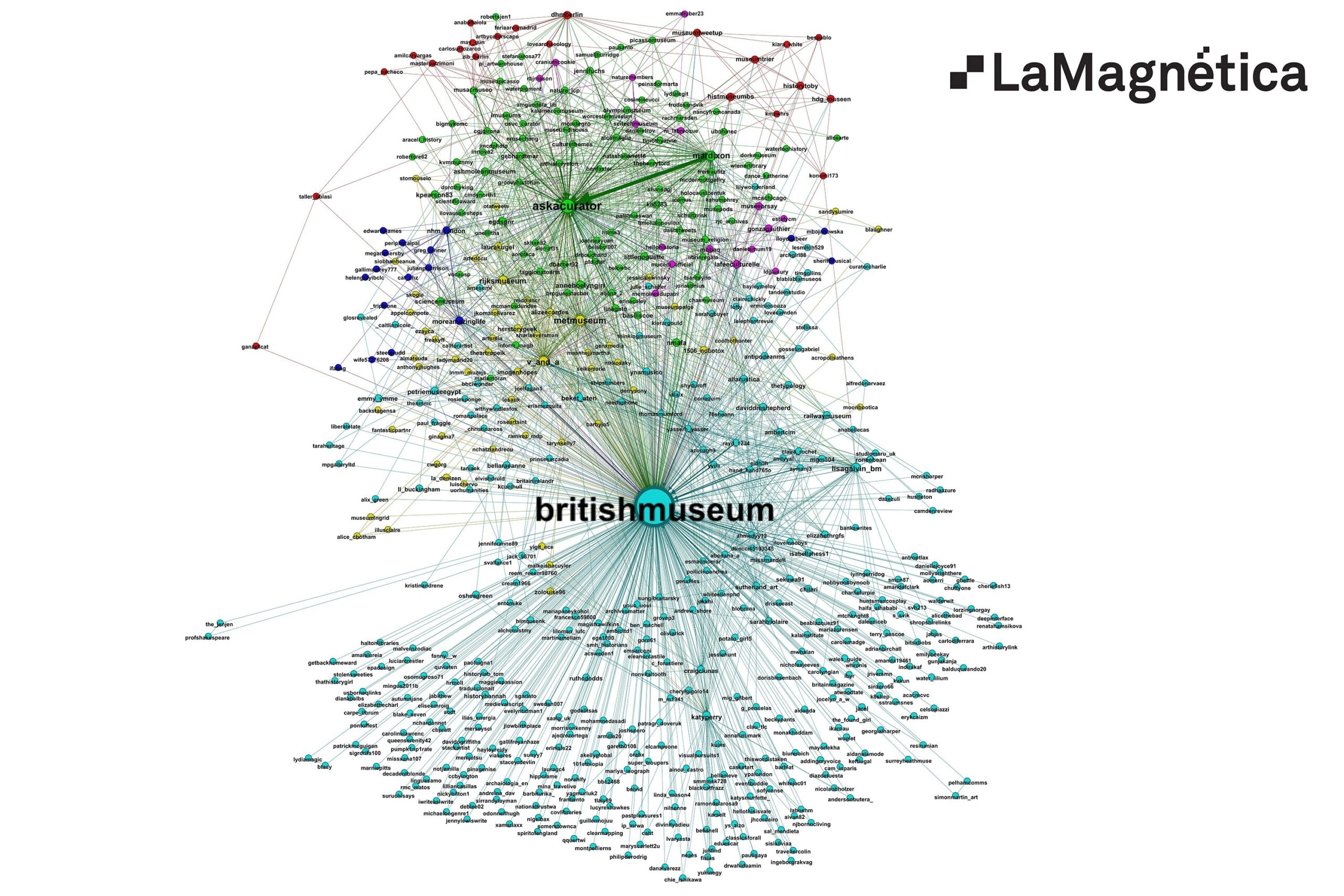
To download a high resolution image (9.000×6.000), click here. Download it and open it with an image editor (see note above).
———-
High resolution images:
Taking into consideration how large these images are, we recommend you to download them and open the graphs with your image viewer software. Opening them in the browser could lead to some issues due to the lack of browser’s cache memory, particularly when opening several images in different tabs.
You can also download all the images in this ZIP file (150 MB) and open them with your Photo Editor software. The whole graph is too large and dense to be read. This is why we have erased the less relevant users in the global graph images, but we have kept them in the country images and in all our stats.
AskACurator – Global Graph (after a first filter, keeping only 2.400 profiles, a 17% of the total): Download
AskACurator – Global Graph (Top 6%): Download
We offer different versions of the country communities’ graphs. The complete versions are more dense and difficult to read but they include all the connections within a community. The stronger the filter, the easier are the graphs to be read. The filter is done by the relevance inside a community based on a Page Rank-like centrality measure.
American Community (Complete): Download
American Community (light filter): Download
American Community (strong filter): Download
Australian Community: Download
British Community (Complete): Download
Britsh Community (Light filter): Download
British Community (Strong filter): Download
French Community: Download
Italian Community: Download
Russian Community: Download
Spanish Community (Complete): Download
Spanish Community (Light filter): Download
We also offer a British Museum’s environment graph about the conversations that took place during the conference.
British Museum environment: Download

